

Invision has now been out there for a while, slowly owning the design space. Giving an overview of Invision – as a product before I actually jump into their User Experience breakdown isn’t really required here. For all those who’re into design, already have used Invision or at least heard the internet talking about it.
So, let me tell you what this post is going to be about, it’s about how Invision has been nailing some little-big details to sell their product better. People usually debate on whether such details are required at an early stage to sell your product and do the users really give a damn about it. Well, thanks to Invision and their whooping success, the point is proven. Yes, my friend, the details do sell.
Let me also clear a fact that I’m not going to be writing about the major and clearly visible UX principles here, this is going to be about the finer details that help your product scale.
1. Meaningful CTA
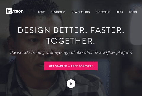
Call To Action button is that one thing products bank on. The conversion rate of a page is also usually measured on the basis of how many times the CTA button gets clicked. Having said that, it’s pretty obvious that CTAs need to be meaningful, they should speak the language of its users.

Admit it, using generic keywords like Sign Up, Log In, Get Started, Purchase, Demo isn’t the right way to do it. Invision very smartly uses meaningful keywords like Get Started – Free Forever!, Request Free Trial, Sign Up Free and more. Now, when you’re offering something for free, isn’t it the right thing to do by mentioning it right on your CTA rather than using some pop-elements (If you know what I mean)?
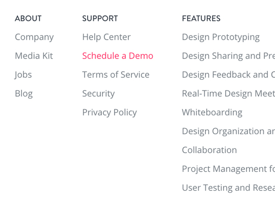
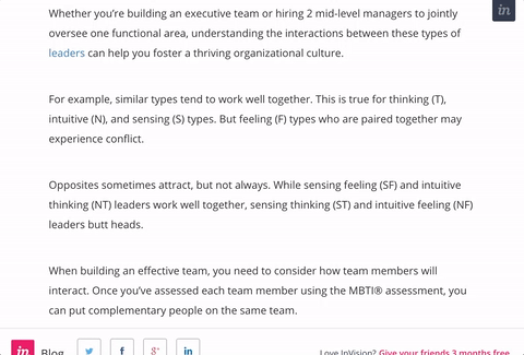
2. Purposeful Disturbance
Invision purposefully highlights the Schedule a Demo link by making it of their brand color. I want you to see the image below and tell me if you were able to spot the link in a glance, most people would be able to, unless they’ve some kind of color sickness. Some designers may debate that it breaks the symmetry of the design and makes it look odd. Well, isn’t that exactly what they’re trying to do here?
3. Easy Assets Download
Where do you look for the assets (logo, usage policies, guidelines) of a brand if you want to mention them somewhere? Would you look for it in the footer navigation or try and figure where they’ve their media kit listed? Well, you just have to right-click on Invision’s logo to download it, as simple as it gets. You may wonder how does a user comes to know about this easter egg unless they’re a reader of darshangajara.com. I had say, wouldn’t you naturally click around the logo if you want to download it?
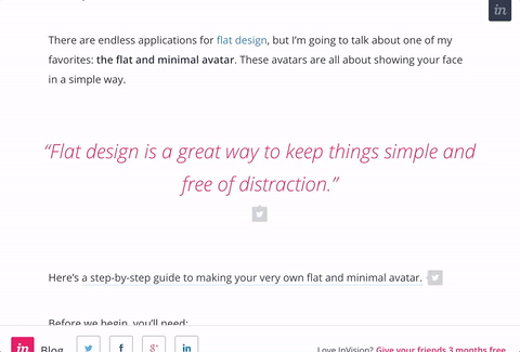
4. Click To Tweet
Invision’s blog is another greatly designed space. Invision nicely structured and added pull quotes with tweetable links even before it was made popular by Medium. Medium obviously took this whole thing of tweeting selected content from a blog post to another level by adding auto-generated images, but yeah, Invision was doing this pull quote thing even before Medium existed in the eyes of public. I think most of modern content sites have already realized the power of pull quotes and are efficiently using it now.
5. Micro-Interactions
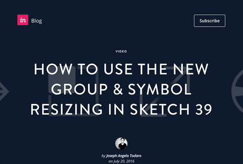
It’s really awesome how adding just a little gifs at the bottom of a blog post makes a whole lot of difference. You must’ve noticed how most blogs add a recaller statement at the end of a blog post to prevent the user from exiting their site. Some generic ones are You Might Also Read This, More Similar Posts, Readers Of This Post Also Read This and more. The problem with generic lies in the word itself, once it’s generalized, people kinda lose their interest in it. Invision did this smart thing of adding micro-interactions (See the images below) to these recaller statements to make the users actually read it.
6. Smart Site Titles
Site title is that thing you see on your browser’s tab. For this tab, it should probably be “How Invision has got it’s UX right” with my logo at the beginning. Now, editing the site title for the SEO purposes is obviously known by most of the internet folks out there, but that’s not the catch. The catch is that that Invision’s blog posts’ site title would change to “Don’t forget to read this…” once you switch your tabs.
It’s only fair to assume that at one instance, a user would have 3 or more tabs opened in the same browser and may miss out on some of the opened tabs. Just imagine, how neat of a solution it is to add such meaningful site title when a tab is switched. Voila, it’s switched but not switched off! (Sorry for the lameness, but can’t help it :p )
Thank you dear Invision for proving yet again that details matter
Please note that this post isn’t endorsed by Invision in any way. This is just me appreciating the good design out there as a fellow design enthusiast. If you find some other little details which I may have missed, go on and comment it down below or simply tweet it to @WeirdoWizard . I had love to hear it back from you. Let’s appreciate the good work, together 🙂

Nice and Informative ..
Thanks, Arun.